Monday, December 02, 2019

Law School: Choose Wisely


The new US Dept of Education data on university graduates' incomes and debt levels illustrate some enormous differences between programs, and particularly problems with the For-profit sector (red dots below).  For the majority of students who have any federal loans or grants, the median debt level and income in the first calendar year after graduation are shown here (click on graph for better resolution):


There is almost a bifurcated market for law schools.  Income in the first calendar year after graduation is closely correlated with the average LSAT scores for the schools' graduates (shown as color in the next graph).  Debt is high at a few elite law schools, whose graduates are well compensated for taking on this debt, as well as some of the least elite schools, especially the few for-profits, whose graduates see little or no economic advantage for having gone to law school. 


To get a better handle on how LSAT scores relate to income out of law school, the next graph shows LSAT scores as the left-right axis (and average debt is shown as color).  Here we can see exactly how dependent first-year income is on the average LSAT score of the schools' students.  Bottom-line: If you can't get into a top-20 (or so) law school, go to a state school and consider law like an advanced degree in English Literature or History -- do it only if you love it and don't need the salary bump.


Note that deviations above or below the trend line may be for varying reasons, good and bad.  For example, Harvard and Yale are the upper right of the graph, but somewhat below the trend line because some of their strongest graduates start their law careers by clerking for a judge, which is prestigious and often leads to a lucrative career, but is not itself very highly paid.

Data Sources:
https://collegescorecard.ed.gov/data/
https://www.ilrg.com/rankings/law/


Sunday, September 29, 2019

Child Mortality around the World


The enormous progress in life expectancy, almost everywhere in the world over the past 200 years, is primarily due to the reduction in child mortality.  It used to be common for close to half of all children to die by age 5, and this figure was still 10% in the US as late as 1928.  Here's a graph showing child mortality and GDP per capita since 1900, with each dot representing a country, and the size of the dot proportionate to population.  The US is the largest red dot, China and India are the largest yellow dots, the countries with even lower mortality rates than the US are mostly in Europe (blue dots) or on the western edge of the Pacific (yellow dots for Japan, South Korea).  Africa continues to have the highest death rates, but it too has seen major improvements.


This graphic is not an original idea.  Hans Rosling famously narrated a similar graph showing life expectancy rather than childhood mortality.  I built the graph primarily to practice some R skills.  Making a graph with the ggplot and gganimate packages takes just a couple minutes, but combining the data from 4 separate files (with population, mortality, and GDP files each having 216 columns for the 216 years of data) took me some time to figure out and get just right.  After cleaning the data files and putting the continent information in the income file, I merged them with the following bit of code.  (Note that "k" increments with every loop, leading to a dataframe of 43392 rows and just 6 columns.)

# build main dataframe "df" used by ggplot
df = data.frame(country=character(), continent=character(), year=integer(), income=integer(), population=integer(), mortality=double(), stringsAsFactors=FALSE)

# Loop through 192 countries & 216 Years (1800-2015) + 10 duplicate years.
k = 0
for(i in 1:192){
for(j in 2:227){
  k = k + 1
  df[k, 1] = df_inc[i, 1]
  df[k, 2] = df_inc[i, 2]
  df[k, 3] = 1798 + j
  df[k, 4] = df_inc[i, j+1]
  df[k, 5] = df_pop[i, j]
  df[k, 6] = df_mort[i, j] / 1000
}}

Data source: https://www.gapminder.org/data/
Hans Rosling video: https://www.youtube.com/watch?v=BPt8ElTQMIg

Monday, May 06, 2019

Phonics Works


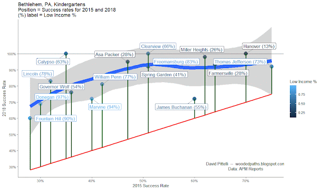
Phonics is an intervention that works – at least in Bethlehem, PA, where the portion of kindergarteners testing at benchmark increased from 47% to 84% from 2015 to 2018 as the District moved from “whole word” to phonics instruction.  What's more, every kindergarten in the District showed marked improvements, with similar gains regardless of 2015 performance and regardless of the percent of students who are low income.  In the graph below, vertical distance above the red line indicates gain in percentage points.


Phonics remains controversial among educators (as does Whole Word).  For a good read on this topic, see this article from APM Reports.

Sunday, January 13, 2019

The Wrong Birthday May Cause ADHD

A recent study of 407,846 children, published in the New England Journal of Medicine (NEJM), showed that the older children within each grade are about 30% less likely to be labeled as having attention deficit–hyperactivity disorder (ADHD). 

Most U.S. school systems group children together in one-year cohorts based on a cutoff date, usually August 31 / September 1.  For those school systems, the NEJM article looked at rates of ADHD diagnosis for all of the children, grouped by month of birth.  The analysis primarily compared ADHD rates for adjacent months, as here:


The graphic above shows that the rate difference between August-born children and September-born children is statistically significant (p < .05; note the 95% error bar clearing the dotted “zero” line), but that no other adjacent months show a statistically significant difference.


I believed that one could show stronger evidence from a more holistic look at the data.  Using the table of data from above, I made a graph using r.  In the graph below, blue columns show the rate of ADHD diagnosis by birth month.  The oldest students, at left, have birthdays in September.  The graph also shows a red curved regression line, and orange 95% error bars for each month, based on a binomial distribution on each month's sample size.


To put this in narrative form, it is not so much that the youngest (August birthday) children have elevated ADHD rates, as that the older half of the class on the left has increasingly lower ADHD rates.  It appears that about a third of the oldest have matured out of the level of behavior which would result in an ADHD diagnosis.  Teachers and pediatricians might wish to take this into account especially before concluding that a child in the younger half of his class has ADHD, at least in borderline cases.

The younger half of the class at right shows a less clear trend.  This nonlinearity is shown by the curved regression line, which is upward sloping and downward curving.  Of course, humans make note of patterns, and random effects may look like a pattern.  To calculate whether these patterns are statistically significant, a regression looking at both the linear and squared features showed strong significance, with p < .001 for the upward sloping linear feature, and p = .001 for the squared feature (the downward curve).  Further analysis, considering that the actual statistical deviation of the measured samples is smaller than their apparent deviation compared to each other, brought p << .001. 

Recent Twitter correspondence with coauthor Timothy Layton provided a plausible explanation for the flattening on the right side of the graph: Children born in the summer are more likely to be held back a year, and thus to become the oldest children in a new cohort – especially if they exhibit less mature behavior.  This holding back may replace an ADHD diagnosis as a solution to behavioral issues, and/or may reduce later ADHD diagnoses as the child is now compared to a younger, less mature cohort.

Apart from what the data is about in this case, this analysis presented some interesting exercises for understanding the use of data:
  • that is categorized or grouped by range;
  • where the sampling error of the measured samples is smaller than their apparent deviation when compared to each other; and
  • where Monte Carlo simulations may prove helpful.