Wednesday, January 26, 2022

Tornadoes and Global Warming

Global warming is real, but the journalists and politicians warning us about the dangers of climate change are as prone to making false claims as are their opponents ("skeptics").  Most recently, we saw this with respect to tornadoes.

On December 10-11, 2021, several powerful tornadoes hit the central United States, reportedly making for "the deadliest December tornado outbreak in United States history".  The next day, Deanne Criswell, head of the Federal Emergency Management Agency (FEMA), said that "This is going to be our new normal.  The effects we are seeing of climate change are the crisis of our generation."  President Biden echoed her claims.

But not every weather disaster is about anthropogenic climate change.  It's possible that global warming could affect tornadoes, but the data is telling us that strong tornadoes are actually declining over the last half century.  If global warming has been affecting the number or strength of tornadoes, then it appears to be weakening them.

We have had good data on tornado counts and strength since about 1970, and it is an uncontestable fact that the official and scientific data we have shows that F2, F3, F4, and F5 tornadoes have all been decreasing over the last 50 years.  ("Strong" tornadoes are usually considered to be F3 or higher.)


Only the weakest (FU, F0, and F1) tornadoes' count has gone up.  This is an artifact of increasingly good detection of weaker tornadoes.*  And even those weak tornadoes have gone down since peaking in 2004. 


I find it rather shocking that demonstrably false claims on this matter are so broadly and credulously covered by the largest media sources.  I think that skepticism and corrections are avoided because few journalists want to be seen as doing anything to "fuel skepticism".  Ironically, this attitude ends up fueling skepticism.


* Note this article on improvements in tornado detection.


Thursday, December 17, 2020

Some States Are Better Than Others

Someone on Twitter: "Tell me the best state without telling me Texas."

Several people answered that they don't know, but they did know that the worst state is Florida.

There are things to like and dislike about every state.  But perhaps the most objective and broadest measure of how good or appealing a place is, is based on the people who have voted with their feet, leaving places with little appeal or opportunity, to migrate to places which are more appealing and provide much opportunity.  By that measure, Florida is clearly the best state over the last decade – the only state with very strong positive international and domestic migration for 2010-2019, which is why it is top right (blue circle) in the scatter graph below. (DC is not far behind, and Texas is doing fairly well by both measures.)

The distance from the sloping red line is each state's total (international and domestic) migration.  The upper right states are the most popular, the lower left the least popular. (Click for higher resolution.)


Domestic

Domestic migration is, necessarily, evenly balanced.  When you include state population (the size of the dots), the graph is evenly balanced on the vertical blue zero line.

The states with the worst domestic outmigration (negative migration) are: Alaska, New York, Illinois, Connecticut, New Jersey.  In general, people have been leaving the Midwest and Northeast for the West and South.  The one Midwestern (here, red) state attracting significant numbers is North Dakota, mostly due to an oil boom.  Only two Northeastern states have seen even slightly positive migration: Maine and New Hampshire.

While the Northwest and Mountain West saw gains, Alaska and Hawaii saw substantial outmigration.  California's outmigration was smaller as a percentage of population, but the largest in the country in absolute terms.

International

For international migration (height above the blue horizontal line), the US regions are more evenly distributed. West Virginia has the weakest international migration; there are not a lot of West Virginia jobs attracting people from overseas.  Massachusetts has attracted a lot of foreign workers, even as domestic outmigration has been considerable.  Boston and its suburbs have been performing very well economically, but this has also made real estate there among the most expensive in the country, pricing a lot of people out.

2020

For 2019-2020, components of population change won’t be available until February, 2021.  In the face of the coronavirus pandemic, the raw percentage changes in population (map and link below) show that most of these trends continued.


Monday, July 06, 2020

Graphing COVID-19

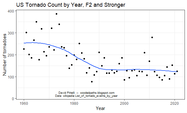
There's been a lot of debate online about how various countries have fared in the face of the COVID-19 pandemic.  Often the countries chosen are cherry-picked, or the measure of deaths (i.e., totals, not rates) says more about the size of the countries' populations than their success or failure in any meaningful sense.

There are just 6 major countries with higher reported death rates than the US.  But the fact that all of them are well-functioning economies and democracies in Western Europe would tend to refute the notion that economic or political backwardness is the key to their high death rates.

In my opinion, the key disadvantages that the US and Western Europe have, relative to less wealthy countries and isolated islands like New Zealand, is that the former are so large and interconnected (in terms of travel).  A Western, especially US, reluctance to wear masks is also a major disadvantage relative to East Asian countries.

To illustrate such comparisons, I've written an R script to download the latest daily data from the European Centre for Disease Prevention and Control (ECDC), and turn daily death rates for selected countries into a line graph, such as here (click on graph for higher resolution; the graph is followed by my R script).

Note that Spain has revised figures downward for a reputed overcount of prior deaths; rather than go back and alter prior days' numbers, they did this by logging 1,918 "negative deaths" on May 25.  Later they revised numbers upward by 1,179 on June 19.


# **********************
# R Code to download and graph ECDC historical daily data
# David Pittelli -- woodedpaths.blogspot.com
# https://www.ecdc.europa.eu/en/publications-data/download-todays-data-geographic-distribution-covid-19-cases-worldwide

setwd("C:/Users/YourDirectory")
rm(list=ls())

# Load functions************
library(ggplot2)
library(scales)
library(RColorBrewer)

# Manual color adjust****************
ggplotColours <- 360="" function="" h="c(0," n="6," o:p="">
  if ((diff(h)%%360) < 1) h[2] <- -="" 360="" h="" n="" o:p="">
    hcl(h = (seq(h[1], h[2], length = n)), c = 100, l = 65)

}

# Download data from web************
df = read.csv("https://opendata.ecdc.europa.eu/covid19/casedistribution/csv", na.strings = "", fileEncoding = "UTF-8-BOM", stringsAsFactors=FALSE)

# convert date info in format 'mm/dd/yyyy'
df$date2 = as.Date(df$dateRep, "%d/%m/%Y")

# Subset rows and add columns ***********************
# eliminate NAs in countryterritoryCode
df = df[!is.na(df$countryterritoryCode),]

# Add deaths per 100 Million column
df$DPC = (df$deaths * 100000000) / df$popData2019

# Add cases per 100 Million column
df$CPC = (df$cases * 100000000) / df$popData2019

# Add 7-day moving averages
# vectors are reversed since MA can only look upwards (or in both directions)
df$DPCMA = rev(filter(rev(df$DPC), rep(1/7,7), sides = 1))
df$CPCMA = rev(filter(rev(df$CPC), rep(1/7,7), sides = 1))
df$deathsMA = rev(filter(rev(df$deaths), rep(1/7,7), sides = 1))

# Add day of week  and 1-7 *****************************
df$dayOfWeek = weekdays(as.Date(df$date2))
df$dayNum = setNames(0:6, c("Sunday", "Monday", "Tuesday", "Wednesday", "Thursday", "Friday", "Saturday"))[weekdays(as.Date(df$date2))]

# Save with a file name including today's date***********
today = paste(substr(date(), 5, 10), substr(date(), 21, 24))
filename = paste(today, "ECDC COVID table.csv")
write.csv(df, filename)

# Just look since March 1
df = df[df$date2 > as.Date("2020-02-29"), ]

# Graph ***************************************
# Select Countries
df2 = df[df$geoId == "ES" | df$geoId == "IT" | df$geoId == "UK" | df$geoId == "SE" | df$geoId == "US" | df$geoId == "DE" |  df$geoId == "KR"|  df$geoId == "NZ",]

# Annotated plot, 7-day Moving Average, linear scale
p = ggplot(data = df2, aes(x = date2, y = DPCMA, group = geoId, color = geoId)) +
     geom_line(size = 1.2) +
      theme_bw() +
      ggtitle(paste("Daily Death Rate from COVID-19, 7-Day smoothing,", today)) +
      theme(plot.title = element_text(size = 24)) +
      theme(axis.title.x = element_text(size=14)) +
      theme(axis.title.y = element_text(size=14)) +
      theme(axis.text.x = element_text(size=14)) +
      theme(axis.text.y = element_text(size=14)) +
      theme(legend.text = element_text(size = 14)) +
      xlab("Date") + ylab("Daily Deaths per 100 Million People") +
      theme(legend.title=element_blank())

# Manual colors; black for US
p +  scale_colour_manual(breaks=c("ES", "IT", "UK", "SE", "US", "DE", "KR", "NZ"), labels=c("Spain", "Italy", "UK", "Sweden", "US", "Germany", "S. Korea", "New Zealand"),
        values =c(ggplotColours(7), "black")) +
      annotate("text", x = as.Date(18425, origin="1970-01-01"), y = 1750, label="David Pittelli -- woodedpaths.blogspot.com\nData from ecdc.europa.eu", col = "black")

Friday, April 24, 2020

Mapping the World of COVID-19


A few days ago I was looking at the COVID-19 data at https://www.worldometers.info/coronavirus/

The website has a table showing data on cases, deaths, recoveries and testing for almost every country in the world.  You can sort the table by any of its columns, but I wanted to be able to see geographic patterns by looking at a map.  So, I decided to practice my R skills by writing code to webscrape the table data and produce a world choropleth map with colors coded to per capita death rates. (Click on map for higher resolution.)


Here is the R code.  I hope it is sufficiently documented to follow, and also that you can see how to modify it to make a choropleth from just about any website's table of country-level data:


# Webscrape COVID
# David Pittelli -- woodedpaths.blogspot.com
# Some code from SNHU IT 697 II
# http://selectorgadget.com/ will give CSS codes such as 'td' for table data.
# Data source: https://www.worldometers.info/coronavirus/

#install.packages('rvest')
#install.packages'rworldmap')

# Load functions************
library(rvest)
library(rworldmap)

setwd("C:/Users/David/Documents/2020 Choropleth")
rm(list=ls())

#scrape table data************
url='https://www.worldometers.info/coronavirus/'
d=read_html(url)

#extract the table data ('td' in html) ************
scraped_td = html_nodes(d, 'td')

# convert the html data to text ************
Tab = html_text(scraped_td)

# extract table head and convert to text for column names ************
# scraped_th = html_nodes(d, 'th')
# TabHead = html_text(scraped_th)

# Remove non-country leading info.  Start with the "1" followed by the Country with most Deaths***
first = min(grep("^1$", Tab)) # The first "1" as whole string in Tab is probably where we want to start
# Use anchors. ^ is the start. $ is the end.
# The start position was 115, then went to 153 on or slightly before 2020 06 01 run.

last = min(grep("Total", Tab)) - 2

Tab2 = Tab[first:last]

#build matrix of data, then convert to data frame************
df=data.frame(matrix(Tab2, ncol=19,byrow=T), stringsAsFactors=FALSE)
df=df[, c(2:16)]

colnames(df) = c("Country", "TotalCases", "NewCases", "TotalDeaths", "NewDeaths", "TotalRecovered", "NewRecovered", "ActiveCases", "CriticalCases", "CPM", "DPM", "TotalTests", "TPM", "Population", "Region")

# Clear out unneeded variables************
# rm(list=setdiff(ls(), "df"))

# Fix countries with abbreviated names************
df[df$Country == "S. Korea", "Country"] = "South Korea"
df[df$Country == "UAE", "Country"] = "United Arab Emirates"
df[df$Country == "DRC", "Country"] = "Democratic Republic of the Congo"
df[df$Country == "CAR", "Country"] = "Central African Republic"
df[df$Country == "Czechia", "Country"] = "Czech Republic"
df[df$Country == "North Macedonia", "Country"] = "Macedonia"
df[df$Country == "Eswatini", "Country"] = "Swaziland"

# Add countries with missing data************
# df = rbind(df, c("Turkmenistan", rep(0, 9), NA, rep(0, 4))) # claims no cases, obviously untrue
# df = rbind(df, c("North Korea", rep(0, 15))) # claims no cases, obviously untrue
df = rbind(df, c("Antarctica", rep(0, 15)))
df = rbind(df, c("Kosovo", rep(0, 9), 66/1.845, 0, 0, 1845000, 'Europe')) # deaths / millions 7/4/20
# source: https://en.wikipedia.org/wiki/COVID-19_pandemic_in_Kosovo#Cases
# df = rbind(df, c("Kazakhstan", rep(0, 15))) # they got data by July
# df = rbind(df, c("Tajikistan", rep(0, 15))) # they got data by July

# Remove commas from text-numbers and change from chr to numeric************
for (i in 2:14) {
df[ , i] = as.numeric(gsub(",","",df[ , i]))
}

# Change NA values to 0
df[is.na(df$DPM), "DPM"] = 0
df[is.na(df$CPM), "CPM"] = 0

# Find highest DPM for country with Population > 1 million
# Only San Marino has higher DPM (as of 4/24/2020)
hmax = max(df[df$Population > 1000000 & !is.na(df$Population) & !is.na(df$DPM), "DPM"])

# Save with a file name including today's date************
today = paste(substr(date(), 5, 10), substr(date(), 21, 24))
filename = paste(today, "COVID table.csv")
write.csv(df, filename)

#join data to a map************
COVIDMap = joinCountryData2Map(df,
                               nameJoinColumn="Country",
                               joinCode="NAME",
                            verbose=TRUE)

# plot the map************
colorbreaks = c(0, 0.01, 0.1, 5, hmax/32, hmax/16, hmax/8, hmax/4, hmax/2, hmax/2 + 0.01, hmax/2 + 0.02, hmax)

mapCountryData(COVIDMap,
     nameColumnToPlot='DPM',
     catMethod = colorbreaks,
     colourPalette = "heat",
     oceanCol = "light sky blue",
     missingCountryCol = "dimgrey",
     borderCol = "black",
     mapTitle = paste("COVID-19 Deaths per Million People,", today))

# Add labels, note that lat/lon is set to erroneous number to be in right place for zoomed graphic
text(x=155, y=45, label="?", col = "dark red", cex = 2)
text(x=100,y=-90, label="David Pittelli -- woodedpaths.blogspot.com", col = "black", cex = 0.8)

Monday, December 02, 2019

Law School: Choose Wisely


The new US Dept of Education data on university graduates' incomes and debt levels illustrate some enormous differences between programs, and particularly problems with the For-profit sector (red dots below).  For the majority of students who have any federal loans or grants, the median debt level and income in the first calendar year after graduation are shown here (click on graph for better resolution):


There is almost a bifurcated market for law schools.  Income in the first calendar year after graduation is closely correlated with the average LSAT scores for the schools' graduates (shown as color in the next graph).  Debt is high at a few elite law schools, whose graduates are well compensated for taking on this debt, as well as some of the least elite schools, especially the few for-profits, whose graduates see little or no economic advantage for having gone to law school. 


To get a better handle on how LSAT scores relate to income out of law school, the next graph shows LSAT scores as the left-right axis (and average debt is shown as color).  Here we can see exactly how dependent first-year income is on the average LSAT score of the schools' students.  Bottom-line: If you can't get into a top-20 (or so) law school, go to a state school and consider law like an advanced degree in English Literature or History -- do it only if you love it and don't need the salary bump.


Note that deviations above or below the trend line may be for varying reasons, good and bad.  For example, Harvard and Yale are the upper right of the graph, but somewhat below the trend line because some of their strongest graduates start their law careers by clerking for a judge, which is prestigious and often leads to a lucrative career, but is not itself very highly paid.

Data Sources:
https://collegescorecard.ed.gov/data/
https://www.ilrg.com/rankings/law/


Sunday, September 29, 2019

Child Mortality around the World


The enormous progress in life expectancy, almost everywhere in the world over the past 200 years, is primarily due to the reduction in child mortality.  It used to be common for close to half of all children to die by age 5, and this figure was still 10% in the US as late as 1928.  Here's a graph showing child mortality and GDP per capita since 1900, with each dot representing a country, and the size of the dot proportionate to population.  The US is the largest red dot, China and India are the largest yellow dots, the countries with even lower mortality rates than the US are mostly in Europe (blue dots) or on the western edge of the Pacific (yellow dots for Japan, South Korea).  Africa continues to have the highest death rates, but it too has seen major improvements.


This graphic is not an original idea.  Hans Rosling famously narrated a similar graph showing life expectancy rather than childhood mortality.  I built the graph primarily to practice some R skills.  Making a graph with the ggplot and gganimate packages takes just a couple minutes, but combining the data from 4 separate files (with population, mortality, and GDP files each having 216 columns for the 216 years of data) took me some time to figure out and get just right.  After cleaning the data files and putting the continent information in the income file, I merged them with the following bit of code.  (Note that "k" increments with every loop, leading to a dataframe of 43392 rows and just 6 columns.)

# build main dataframe "df" used by ggplot
df = data.frame(country=character(), continent=character(), year=integer(), income=integer(), population=integer(), mortality=double(), stringsAsFactors=FALSE)

# Loop through 192 countries & 216 Years (1800-2015) + 10 duplicate years.
k = 0
for(i in 1:192){
for(j in 2:227){
  k = k + 1
  df[k, 1] = df_inc[i, 1]
  df[k, 2] = df_inc[i, 2]
  df[k, 3] = 1798 + j
  df[k, 4] = df_inc[i, j+1]
  df[k, 5] = df_pop[i, j]
  df[k, 6] = df_mort[i, j] / 1000
}}

Data source: https://www.gapminder.org/data/
Hans Rosling video: https://www.youtube.com/watch?v=BPt8ElTQMIg

Monday, May 06, 2019

Phonics Works


Phonics is an intervention that works – at least in Bethlehem, PA, where the portion of kindergarteners testing at benchmark increased from 47% to 84% from 2015 to 2018 as the District moved from “whole word” to phonics instruction.  What's more, every kindergarten in the District showed marked improvements, with similar gains regardless of 2015 performance and regardless of the percent of students who are low income.  In the graph below, vertical distance above the red line indicates gain in percentage points.


Phonics remains controversial among educators (as does Whole Word).  For a good read on this topic, see this article from APM Reports.

Sunday, January 13, 2019

The Wrong Birthday May Cause ADHD

A recent study of 407,846 children, published in the New England Journal of Medicine (NEJM), showed that the older children within each grade are about 30% less likely to be labeled as having attention deficit–hyperactivity disorder (ADHD). 

Most U.S. school systems group children together in one-year cohorts based on a cutoff date, usually August 31 / September 1.  For those school systems, the NEJM article looked at rates of ADHD diagnosis for all of the children, grouped by month of birth.  The analysis primarily compared ADHD rates for adjacent months, as here:


The graphic above shows that the rate difference between August-born children and September-born children is statistically significant (p < .05; note the 95% error bar clearing the dotted “zero” line), but that no other adjacent months show a statistically significant difference.


I believed that one could show stronger evidence from a more holistic look at the data.  Using the table of data from above, I made a graph using r.  In the graph below, blue columns show the rate of ADHD diagnosis by birth month.  The oldest students, at left, have birthdays in September.  The graph also shows a red curved regression line, and orange 95% error bars for each month, based on a binomial distribution on each month's sample size.


To put this in narrative form, it is not so much that the youngest (August birthday) children have elevated ADHD rates, as that the older half of the class on the left has increasingly lower ADHD rates.  It appears that about a third of the oldest have matured out of the level of behavior which would result in an ADHD diagnosis.  Teachers and pediatricians might wish to take this into account especially before concluding that a child in the younger half of his class has ADHD, at least in borderline cases.

The younger half of the class at right shows a less clear trend.  This nonlinearity is shown by the curved regression line, which is upward sloping and downward curving.  Of course, humans make note of patterns, and random effects may look like a pattern.  To calculate whether these patterns are statistically significant, a regression looking at both the linear and squared features showed strong significance, with p < .001 for the upward sloping linear feature, and p = .001 for the squared feature (the downward curve).  Further analysis, considering that the actual statistical deviation of the measured samples is smaller than their apparent deviation compared to each other, brought p << .001. 

Recent Twitter correspondence with coauthor Timothy Layton provided a plausible explanation for the flattening on the right side of the graph: Children born in the summer are more likely to be held back a year, and thus to become the oldest children in a new cohort – especially if they exhibit less mature behavior.  This holding back may replace an ADHD diagnosis as a solution to behavioral issues, and/or may reduce later ADHD diagnoses as the child is now compared to a younger, less mature cohort.

Apart from what the data is about in this case, this analysis presented some interesting exercises for understanding the use of data:
  • that is categorized or grouped by range;
  • where the sampling error of the measured samples is smaller than their apparent deviation when compared to each other; and
  • where Monte Carlo simulations may prove helpful.


Tuesday, November 20, 2018

Global Cooling?


I was reading "The 1970s Global Cooling Consensus was not a Myth" at https://wattsupwiththat.com/2018/11/19/the-1970s-global-cooling-consensus-was-not-a-myth/

And so I decided to make a quick graph in R showing the extent of this consensus.  Here, -1 depicts a peer-reviewed scientific article predicting global cooling, 0 is a neutral article, and 1 predicts global warming.  (Dots are spread out a bit with the jitter command.)  Conclusion: While far from unanimous, the majority position in the late 1960s through early 1970s appears to be that global cooling is the likelier trend. (Not that that tells us much about the strength of current science.)


Saturday, April 23, 2016

Prep Schools and Test Scores
How do we rate teachers and schools?  One way, which has the advantage of being objective, but which is still controversial, is to consider their students’ test scores, and how much they go up while the students are being taught by a given teacher or at a given school.  The No Child Left Behind Act has likewise mandated tests for most public school students at a few points in their schooling.  We don’t have such mandated tests at private schools, but many private high schools (“prep schools”) require Secondary School Admission Tests (SSATs) of all their applicants, and have graduates who almost uniformly are applying to colleges and taking the SAT test.

This scatter graph shows information on the students’ testing at several prep schools which might be of interest to a student living in Massachusetts or New Hampshire, and which have released testing information to Boarding School Review (n.d.).

For each school, the horizontal location of the bubble marking the school shows how well the school’s students tested when they applied to the school (the average SSAT score, measured as a percentile, of incoming students).  And the vertical location of the bubble shows how well the school’s students test in their senior year at the school (the average SAT score, on a scale which goes to 2400) of graduates.

Since the SSAT and SAT test essentially the same thing (preparation for academic schoolwork, a combination of intelligence and learning measured mostly with regard to mathematical understanding, vocabulary and reading skill), we should not be surprised to see a fairly strong correlation between the two statistics.  This correlation can be expressed by an r2 of 78%, or by noting how nearly the schools’ bubbles fall along the best-fit diagonal trend line, as shown:


To the extent each school deviates above the trend line, we can say that the school is doing an above-average job of educating its students (at least, to the extent that SAT scores reflect education), and schools below the trend line appear to not be doing so well on this measure.  (The size of each circle indicates the number of students at the school; the color green indicates a girls-only school, blue a coed school, orange a day school.)

However, the information in this graphic should be a rather small part of judging a school’s academics, and academic strength may not be the most important factor when judging how happy or successful a particular child will be at a particular school.

Further, the height of the dots above the diagonal line may not be as important in choosing a school as is where the school falls along the diagonal line.  Although most people want to go to the most selective prep school (or college) that they get into, it is unclear whether this is the ideal choice in terms of academic progress, let alone social life.  Imagine a student who scores at the 90th percentile on the SSAT.  At a school near the center or on the left of the chart she will be among the stronger students; this may lead to increased self-confidence and self-identification as a scholar; on the other hand, it may instead lead to laziness as a moderate effort may be all that is necessary to have average or even above-average grades.  At an academically tougher school on the right of the chart, the 90th-percentile scorer will likely not be among the stronger students; this may lead to harder work to keep up with peers, or it may lead to frustration and burnout.  So in choosing a school, one might have to guess whether one’s child is more likely to suffer from laziness or from low self-esteem.

A final caveat: With any system of measurement, the accuracy of the measurement goes down to the extent that the measured entity or the measurer has a stake in the outcome.  And as with public schools, colleges and law schools, prep schools have in the past sometimes fudged input and outcomes statistics.  One wouldn’t want to penalize a school for being honest.

References

Boarding School Review. (n.d.). Retrieved from http://www.boardingschoolreview.com/

SSAT.org. (2013). Scores: How to read your score report. Retrieved from www.ssat.org/scores/read-score-report